The Instagram Revolution Will Be Aestheticized
Walk through any gentrified neighborhood and you’ll spot them immediately: the carefully distressed protest posters wheat-pasted on boutique coffee shop walls, the “Resist” tote bags hanging next to $200 jackets, the revolution commodified into lifestyle branding. What started as genuine grassroots visual language has been processed through the content machine until it emerges as sanitized rebellion, safe enough for corporate social media feeds yet hollow enough to mean absolutely nothing.
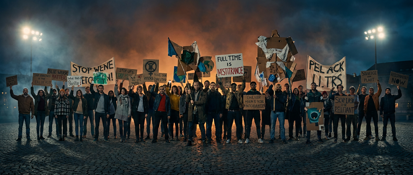
This isn’t some boomer complaint about kids these days ruining activism with their phones. The visual grammar of protest has always evolved, from the bold geometric forms of Russian Constructivism bleeding into labor organizing posters to the psychedelic anti-war graphics of the 1960s. But something fundamentally different happened when protest aesthetics got algorithmically optimized for engagement metrics rather than material change.
The shift wasn’t subtle. Remember when every brand suddenly discovered they had values during the 2020 uprisings? Corporate design teams started cranking out solidarity graphics with the same earnestness they usually reserved for seasonal sales campaigns. The visual language of resistance became a font choice, a color palette, a mood board for brands looking to cash in on the moment’s moral clarity.
The Underground Keeps Moving
But here’s what the brand managers missed while they were busy co-opting last year’s revolutionary aesthetics: the real work never stopped moving. While mainstream activism settled into Instagram-friendly templates, the spaces that actually matter kept evolving their visual languages in directions too weird, too specific, too genuinely threatening for corporate adoption.
Take the design work coming out of mutual aid networks in cities like Detroit and Baltimore. These aren’t the sleek infographics that go viral on Twitter. They’re photocopied flyers with hand-drawn maps showing where to find free groceries, crude but effective graphics explaining tenant rights, urgent announcements designed for speed and function over aesthetic appeal. The typography is whatever font came with the community center’s ancient computer. The images are pixelated stock photos or drawings made by whoever had five minutes between organizing meetings.
This aesthetic messiness isn’t accidental or apologetic. It’s a deliberate rejection of the polished visual culture that positions activism as another lifestyle choice rather than survival work. When your organizing budget is $50 and your deadline is tomorrow because people need food today, you develop a design philosophy that puts getting information to people who need it over looking good on social media.
The Authenticity Trap
The problem with celebrating “authentic” grassroots aesthetics is that authenticity itself has become a brand position. Underground venues get written up in lifestyle magazines precisely because their gritty visual identity reads as real in a world of digital simulation. The moment we start fetishizing the aesthetic choices of survival-based organizing, we risk turning those choices into another style to be appropriated.
Consider how quickly the visual language of prison abolition organizing got absorbed into liberal reform messaging. The bold, stark graphics that originally communicated urgent demands for systemic change got softened into calls for “criminal justice reform” that threaten nobody’s bottom line. The same fonts and layout principles, but drained of their original context and political content.
This isn’t just about visual theft. It’s about how capitalism’s hunger for new aesthetic content transforms even oppositional culture into raw material for the next trend cycle. The underground venue you discovered six months ago is now booking corporate events. The radical collective whose graphics you admired is now licensing their designs to nonprofits with questionable funding sources. The revolution will not be televised, but it will be turned into a mood board for next season’s activism-inspired fashion line.
Beyond the Binary
The tension between effective communication and aesthetic co-optation isn’t new, but digital culture has sped up the cycle to an almost absurd degree. A piece of radical visual culture can travel from the streets to the brand manager’s desk in weeks rather than years. This speed creates a false choice between hiding underground or accepting inevitable appropriation.
Some of the most interesting work happening right now refuses this binary entirely. Collectives like the Design Justice Network are developing frameworks for visual communication that center community needs while building in protections against extraction. Their approach isn’t about creating perfect graphics that will never be co-opted, but about developing sustainable practices for visual culture that strengthen communities rather than depleting them.
These frameworks recognize that good design isn’t neutral. The choice to use accessible fonts isn’t just aesthetic, it’s political. The decision to design for print rather than digital-only distribution acknowledges that not everyone has reliable internet access. The commitment to training community members in basic design skills builds capacity rather than dependence on outside expertise.
The Long Game
What separates meaningful protest aesthetics from their commodified versions isn’t just visual style but structural relationship. The graphics that actually move people toward collective action tend to emerge from the communities they’re trying to reach. They’re designed by people who understand the specific context, constraints, and communication patterns of their audience because they’re part of that audience.
This doesn’t mean effective activist design has to look amateur or avoid visual sophistication. Some of the most powerful protest graphics in recent memory have been technically excellent while remaining rooted in specific community contexts. The key difference is accountability. When designers are answerable to the communities their work helps rather than distant clients or abstract causes, the work tends to stay connected to actual organizing rather than drifting into symbolic gesture.
The underground will keep moving, creating new visual languages faster than brands can catalogue and appropriate them. But the more interesting question isn’t how to stay ahead of the appropriation cycle. It’s how to build design practices that strengthen communities regardless of whether they get co-opted. Because in the end, the revolution won’t be brand-managed, even if capitalism will certainly try to sell it back to us.
What protest aesthetics are you seeing emerge in your own community that haven’t hit the trend reports yet? The best way to understand this stuff is to find the organizing happening in your area and see how they’re solving their visual communication challenges with whatever resources they actually have.