The Commodification of Resistance
Walk through any design district today and you’ll find studios proudly displaying mood boards that steal the visual language of revolution. Distressed typefaces that once adorned hastily printed manifestos now sell boutique coffee. The raised fist, that powerful symbol of solidarity born from decades of struggle, hawks everything from sneakers to cryptocurrency. What we’re watching isn’t just cultural appropriation. It’s the systematic gutting of protest aesthetics, turning tools of resistance into consumer products.
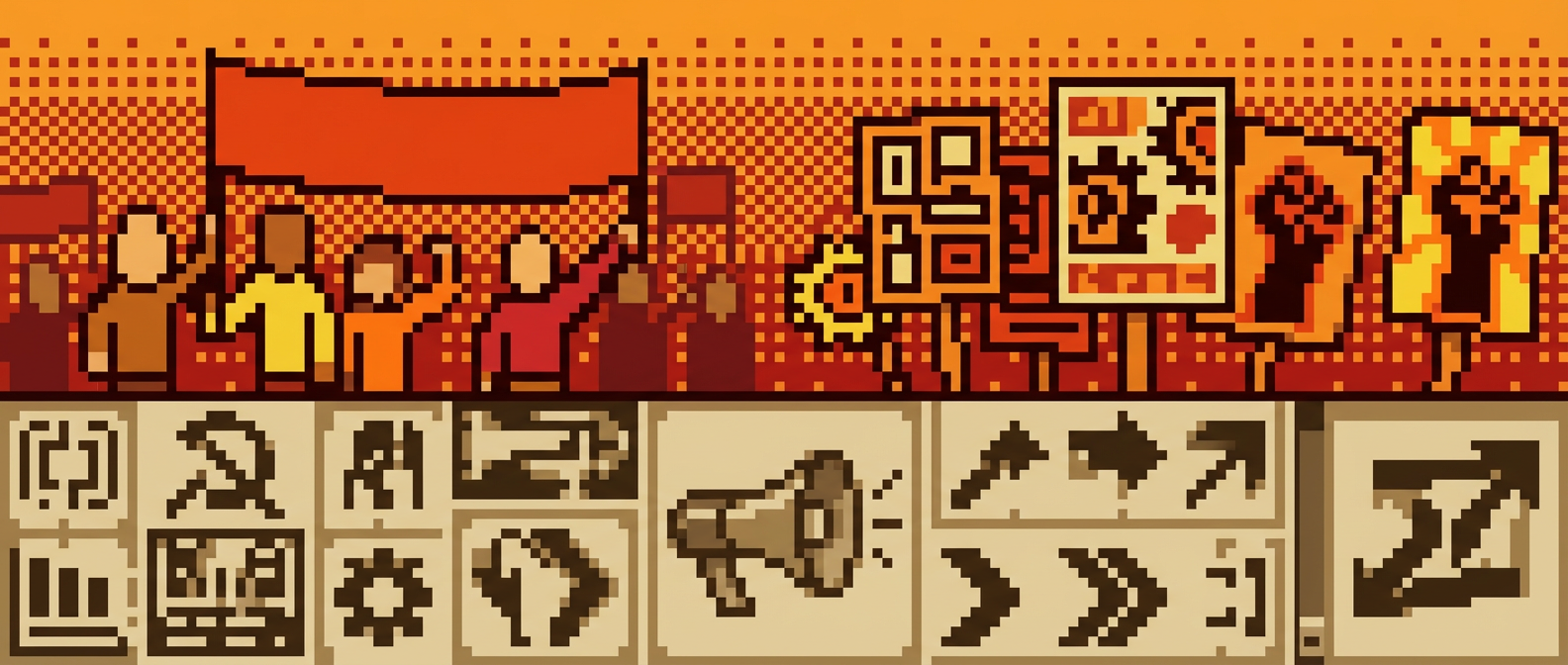
This transformation didn’t happen overnight. The visual vocabulary of dissent has always been fluid, borrowing from street art, zine culture, and guerrilla theater. But something changed when major brands began hiring the same designers who cut their teeth creating flyers for Black Lives Matter protests and anti-gentrification campaigns. The aesthetics stayed the same. Their revolutionary potential disappeared the moment they entered the boardroom.
Consider what happened to wheat paste posters, once the backbone of grassroots organizing. These cheap, temporary pieces could appear overnight on any surface, carrying urgent messages about housing rights or police brutality. Now that same aesthetic sells artisanal bread at farmers markets, the rough edges and urgent typography stripped of context and consequence. The medium that once democratized public discourse has become another lifestyle brand signifier. It makes me sick.
When the Underground Goes Above Ground
The pipeline from street to studio tells a familiar story of cultural theft, but protest aesthetics present a unique case study in how capitalism neutralizes its critics. Unlike fashion or music subcultures, activist design carries explicit political content. It’s supposed to change minds and mobilize bodies. When that visual language gets absorbed into commercial design, it doesn’t just lose its edge. It actively undermines the movements it once helped.
Take the evolution of social justice typography. The bold, condensed fonts that emerged from labor organizing and civil rights movements carried specific meanings of urgency and solidarity. These typefaces were chosen not for their aesthetic appeal but for their ability to get critical information across quickly and clearly under hostile conditions. When a tech startup uses the same typeface to announce their latest funding round, they’re not just borrowing a look. They’re stealing the visual trust that activists built through decades of consistent struggle.
The irony runs deeper than surface aesthetics. Many of the designers now working for Fortune 500 companies learned their craft in activist spaces, developing skills while creating materials for protests against the very corporate structures they now work for. This isn’t about individual moral compromise. It’s about an economic system that systematically captures and defangs its opposition, offering individual advancement as the price for collective surrender.
The Aesthetics of Authentic Resistance
Real protest aesthetics emerge from constraint and urgency, not design briefs and focus groups. The photocopied zines of ACT UP, the hand-painted banners of Occupy Wall Street, the stark black and white photography of the Black Panther newspaper. These visual languages developed organically from the conditions of their creation. Limited budgets, hostile environments, and the need for rapid communication shaped every design choice.
This authenticity can’t be replicated in a studio setting, no matter how many mood boards reference “grassroots energy” or “authentic rebellion.” Real activist design carries the traces of its creation: the smudged ink from midnight printing sessions, the weathered edges from being passed hand to hand, the imperfect registration that speaks to urgency over polish. These aren’t stylistic choices to be copied. They’re the inevitable marks of design born from necessity rather than aspiration.
Contemporary activist movements understand this distinction and have begun developing new visual languages that resist easy theft. The distributed meme culture of recent protests, the deliberately temporary nature of chalk art and projection mapping, the use of augmented reality to overlay protest messages onto corporate spaces. These approaches recognize that staying ahead of co-optation requires constant innovation and a willingness to abandon successful tactics once they’ve been captured.
The Memory Palace of Resistance
What we lose when protest aesthetics get sanitized isn’t just visual history. It’s the record of how ordinary people imagined alternative futures. The crude collages of situationist publications, the bold graphics of farmworker organizing, the DIY punk aesthetic of riot grrrl zines. These artifacts document not just what activists opposed, but what they envisioned in its place. When these visual languages get stripped of context and repurposed for commercial use, we lose access to that radical imagination.
The venues where these aesthetics developed face their own extinction pressures. The community centers, independent print shops, squatted warehouses, and radical bookstores. Rising rents and hostile city policies eliminate the physical spaces where activist culture could develop organically. The result is a feedback loop: without spaces for authentic political culture to emerge, the only visible examples of “resistance aesthetics” come from commercial sources, further normalizing the idea that opposition to capitalism must itself be a branded product.
This cultural amnesia has practical consequences. Young activists, searching for visual models, increasingly encounter corporate interpretations of protest aesthetics rather than the original sources. The result isn’t just aesthetic drift but political confusion, as the visual language of resistance becomes detached from the material struggles that gave it meaning. When revolution looks like a marketing campaign, it becomes harder to tell the difference between real organizing and brand activation.
Beyond the Studio System
The challenge facing contemporary activist design isn’t how to create more compelling graphics. It’s how to develop visual languages that resist capture while remaining accessible to broad audiences. This requires understanding that aesthetics and politics can’t be separated, that the way movements look inevitably shapes how they’re perceived and who feels welcome to participate.
Some of the most promising work happening now operates outside traditional design frameworks entirely. Community-based media projects that train residents to create their own visual advocacy materials. Protest movements that deliberately embrace “amateur” aesthetics to signal their grassroots nature. Collaborative design processes that prioritize collective ownership over individual authorship. These approaches suggest possibilities for activist aesthetics that can’t be easily packaged and sold back to us.
The death of protest aesthetics as we knew them might actually open space for something more radical. Visual cultures that refuse the logic of consumption entirely, that see design as a collective practice rather than a professional service. But realizing this potential requires mourning what we’ve lost and understanding how we lost it. Only then can we begin building something that capital can’t touch.
Have you noticed similar transformations in your local activist communities? What visual languages are emerging that might resist co-optation? The conversation continues in spaces that haven’t been gentrified yet. Find them while you still can.